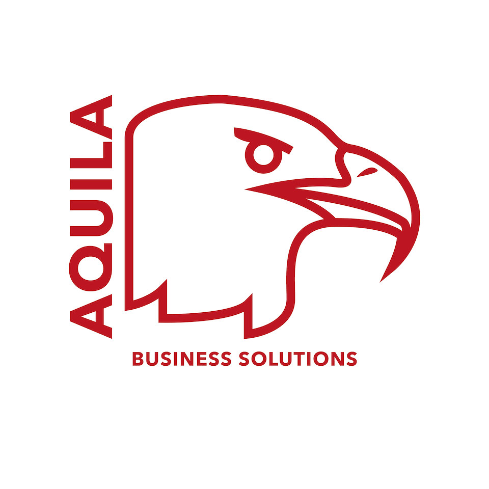
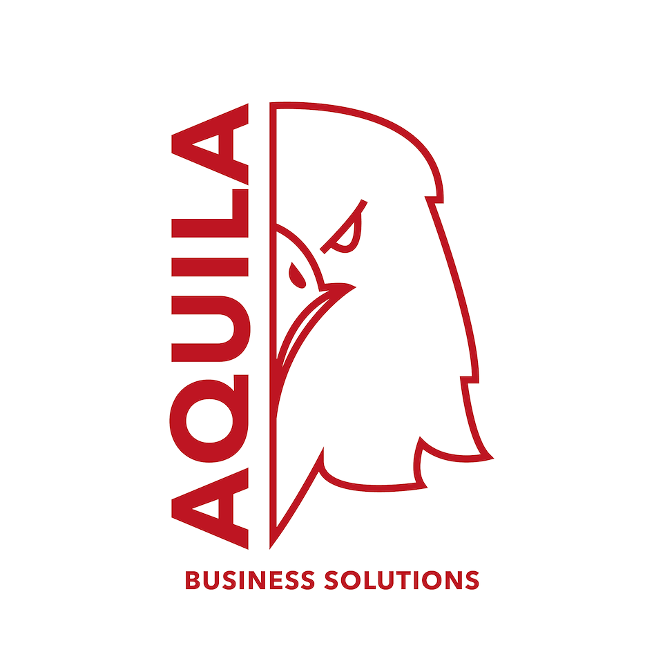
This variant uses a side view headshot of an Eagle, similar to ancient Roman designs, as a reference to the latin name while setting the text in a modern fashion. This pairing of old and modern design elements gives it a classy and mature feel while keeping it minimal enough so as to not clutter a letterhead.
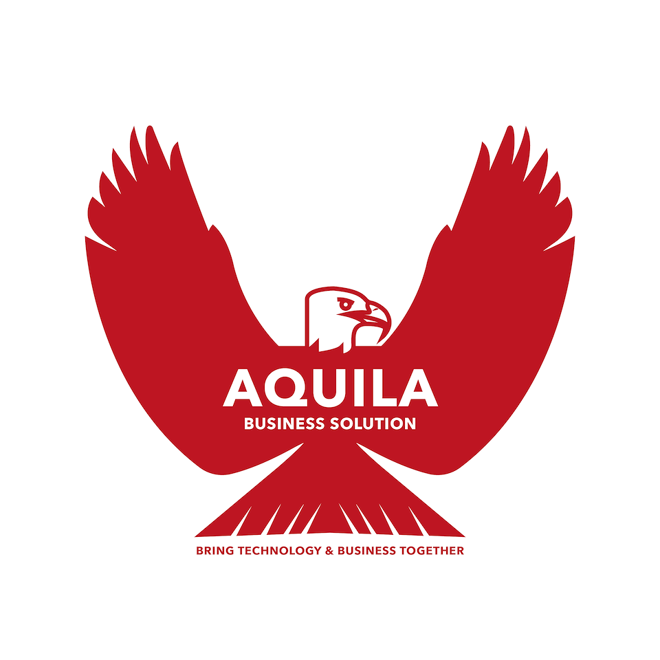
This full spread eagle design houses the pleasingly symmetrical Aquila name in white across the chest and wings of the bird and contrasts nicely with the red. The slogan finds a natural home beneath the tail feathers.
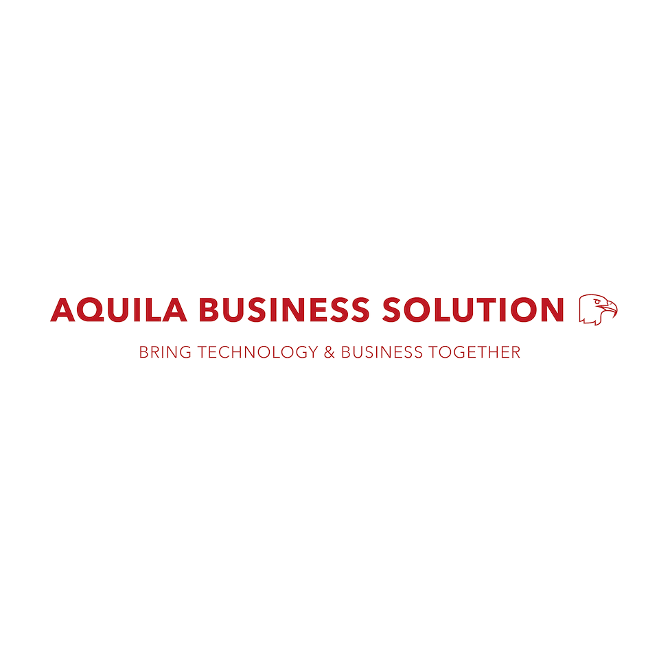
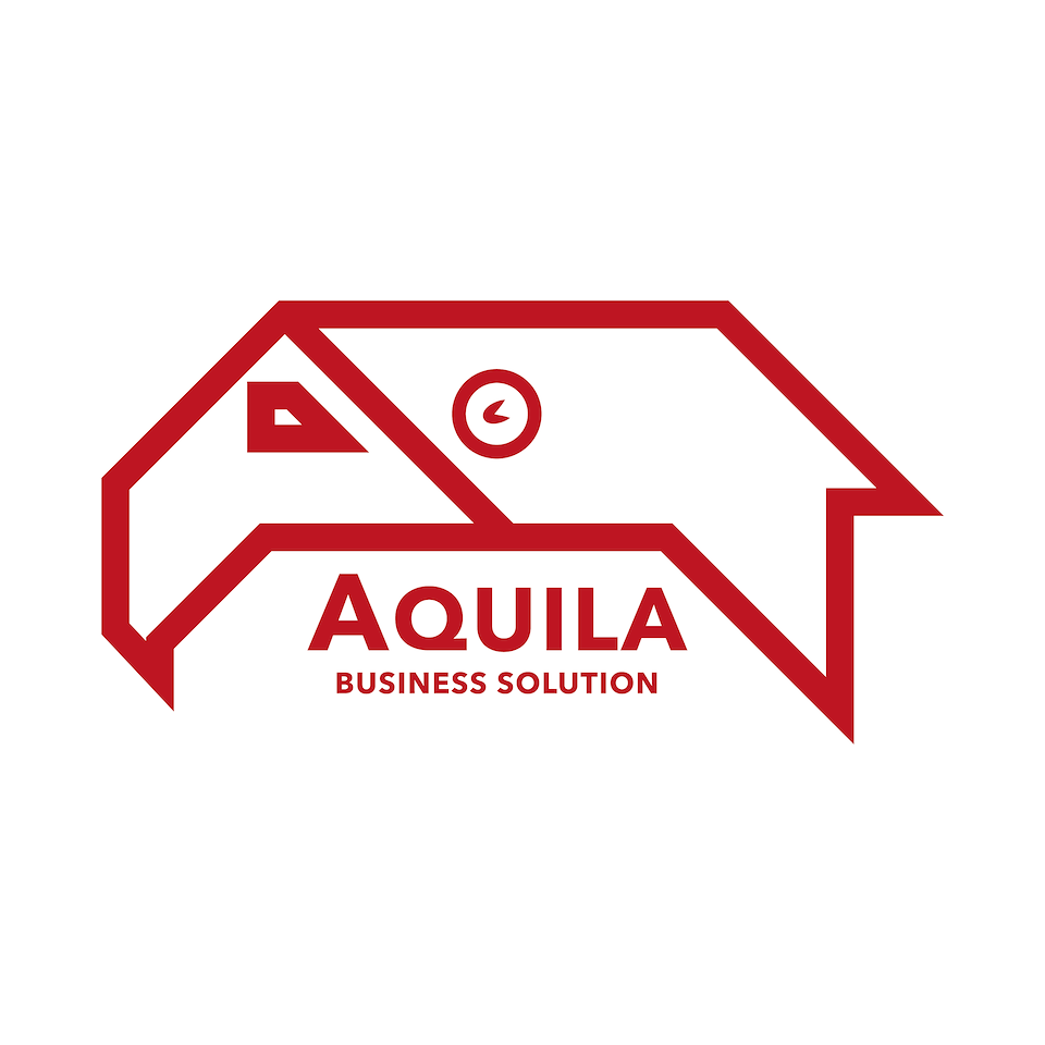
This type treatment variant puts the name and illustration on almost equal footing. This variant would be more for spaces such as the top of emails, web banners etc. where one of the above variants wouldn’t work.
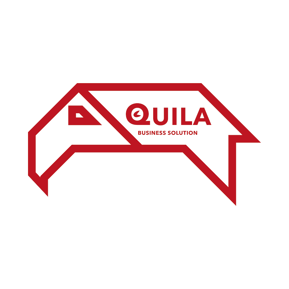
Just to test the waters, I experimented with a less mature variant. It wasn’t entirely successful but it helped me get a concept out of my head which was invaluable at the time to move past.

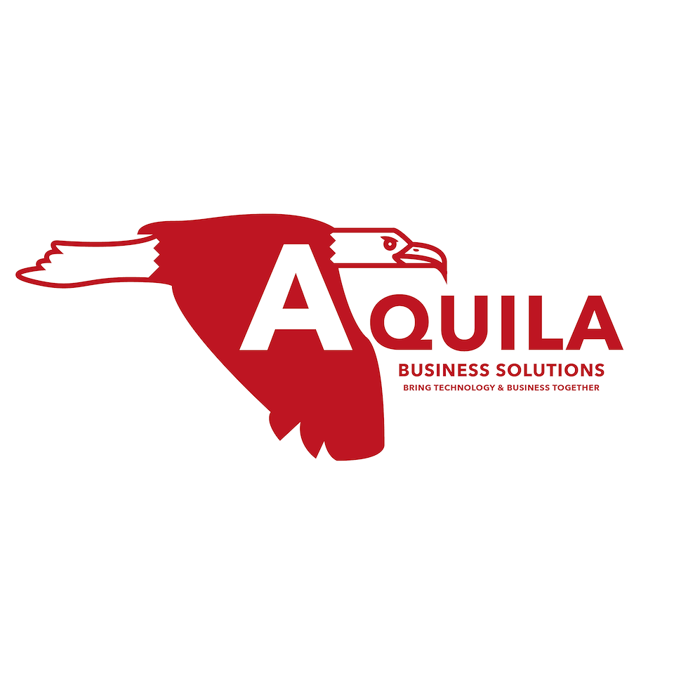
This more abstract idea played with the rather nice symmetry of the word ‘Aquila’. I dropped the weight of the typeface down to better play with the line work of the illustration as I was directly combining illustration with type.
One of my earlier ideas using the beak as the ‘A' and the 'Q’ as the eye, it had to be done as an illustrator to get it out of my system. Legibility ultimately was the concepts downfall.
The much harder geometric variants remind me of Native American artwork, it grabs the eye for sure but it is rather harsh as a business logo. This has more traditionally set type.
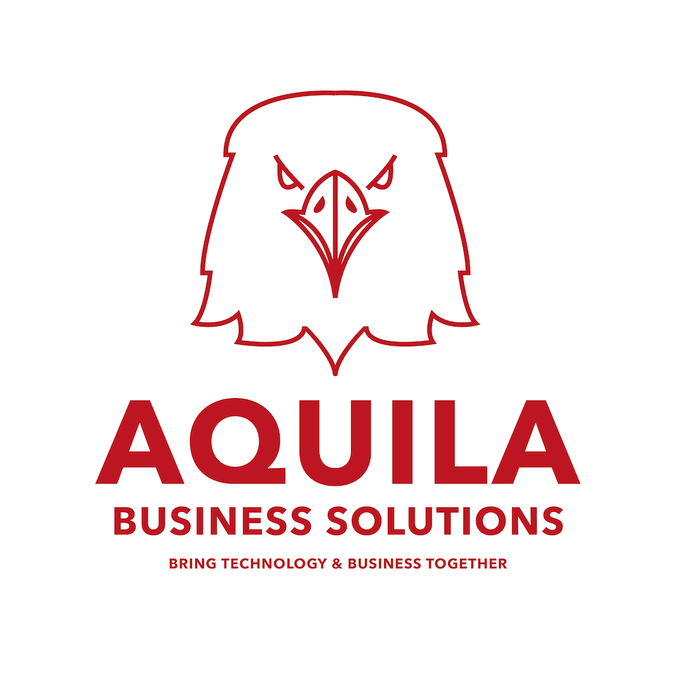
This concept used a head on Eagle which had a lot of confidence to it, as a business analytics company it appealed to me that it looked very ‘in charge’ without being too heavy in line work.
This variation of the previous design maintained the confidence but had a more contemporary layout that could look sharp on anything from stationary to Polo shirts.