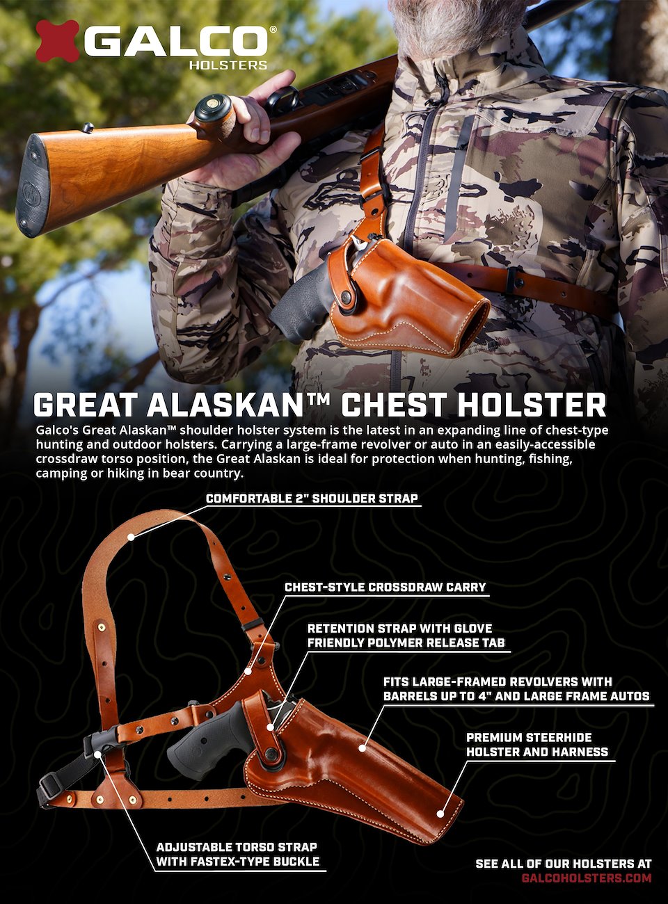
One of my personal favorites, bringing the outdoors into the 21st century with some callouts, subtle topographic texture and a high res in-use photo as the header.
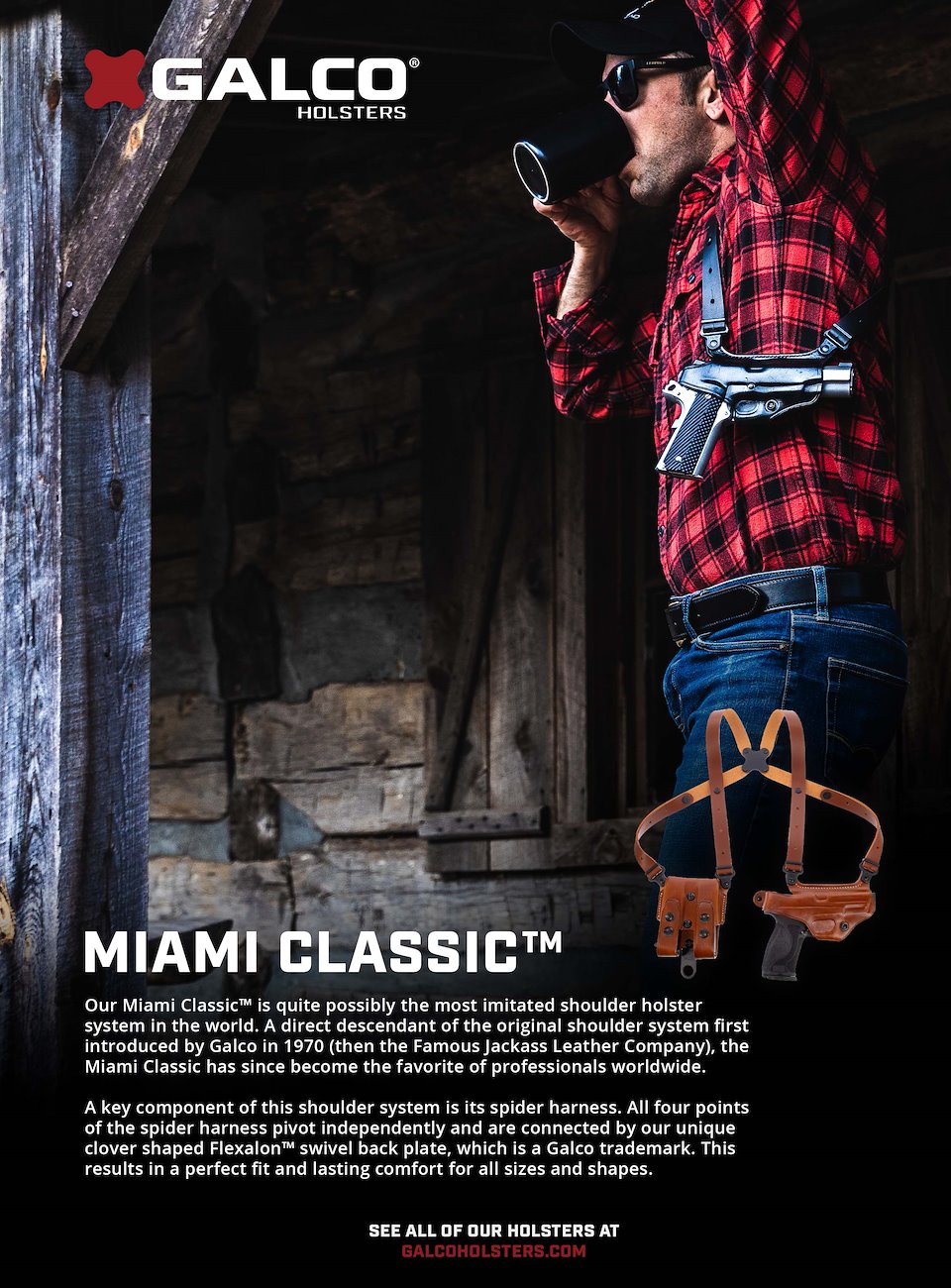
A more traditional magazine ad with a popular in-use photo of ours spanning most of the page with some simple type and product photo at the bottom.
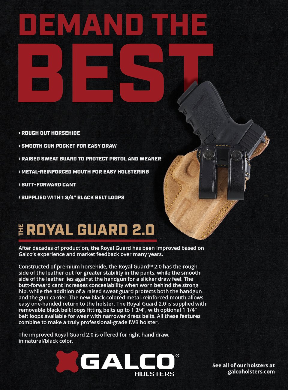
This version for the Royal Guard 2.0 was an experiment in heavier type use, going for an attention grabbing 'headline' look to the 'Demand the Best' type. I wanted something that wasn't shy about being a bit darker, to contrast with the Royal Guard holster.
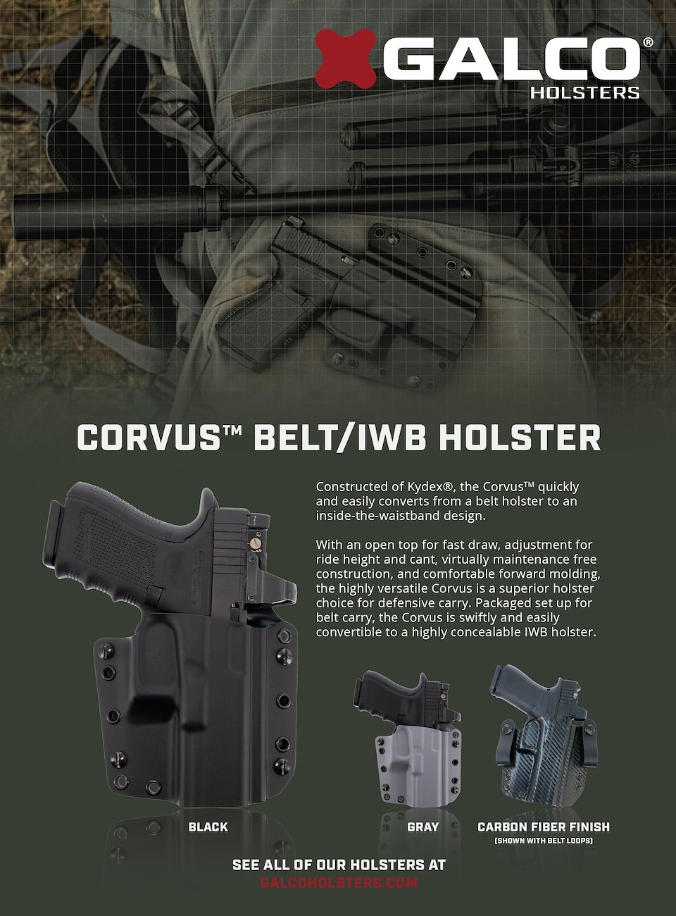
It's important to me to normalize suppressors and all NFA items, so having this shot as an option to pair with showing the Corvus' versatility as an IWB/OWB holster practical for off-grid activities was a win-win. I was hoping to appeal to the growing audience of younger outdoorsmen with this ad.
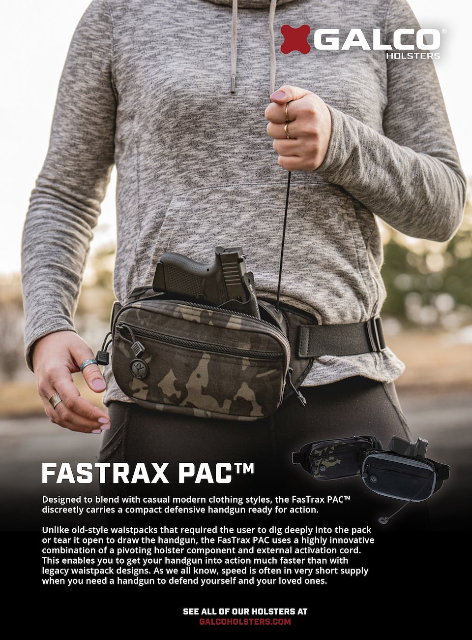
Another more minimal in-use, type and product shot ads, this one really using the vertical format to show off the function of the FastTrax Pac pull string.
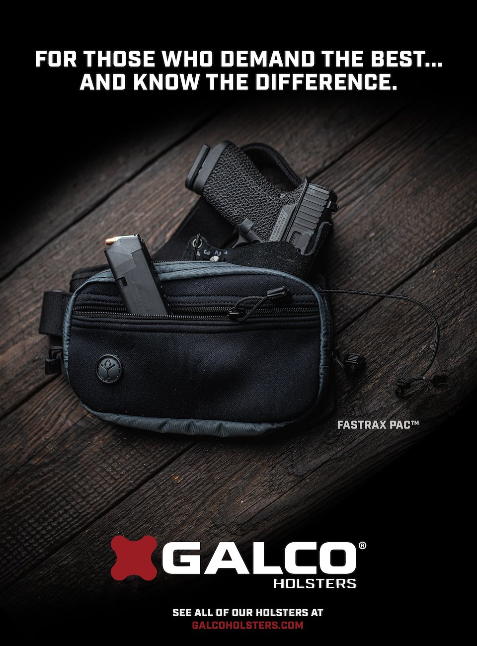
Another darker, moody shot. I personally find these to be the better looking ads in magazines, with white backgrounds looking like the designer didn't know what to fill the space with more often than not, especially when product shots and text are just 'floating' in a sterile environment. There's a time and a place for cleaner looking design, but I think it's much rarer in this industry, being focused on hard-use life saving tools.