This was a more old school design, like what you would see in an outdoor store catalogue, as requested by higher ups.
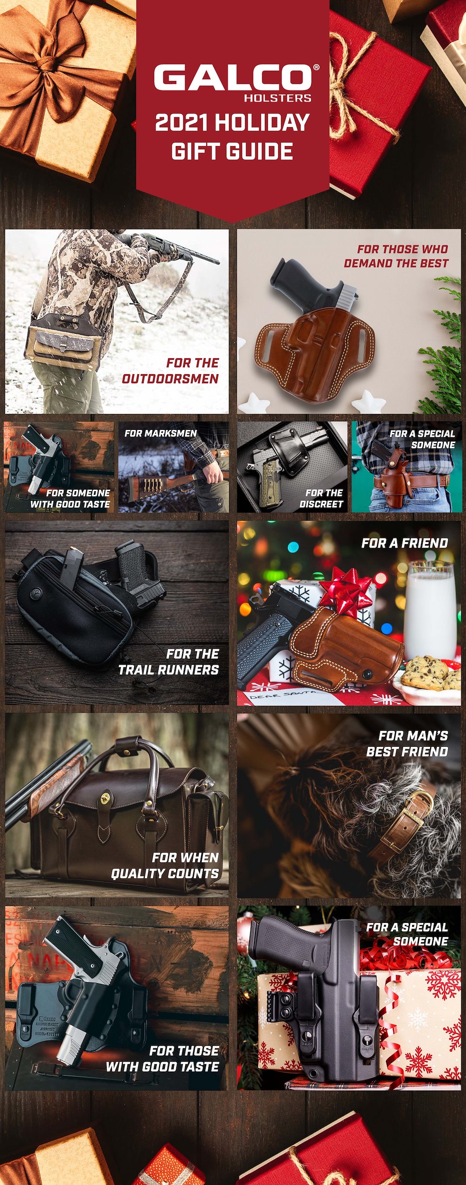
This variant was a bit more modern, borrowing more from the look of December website landing pages and leaving the body copy for once you've clicked the products and gone to their individual pages.
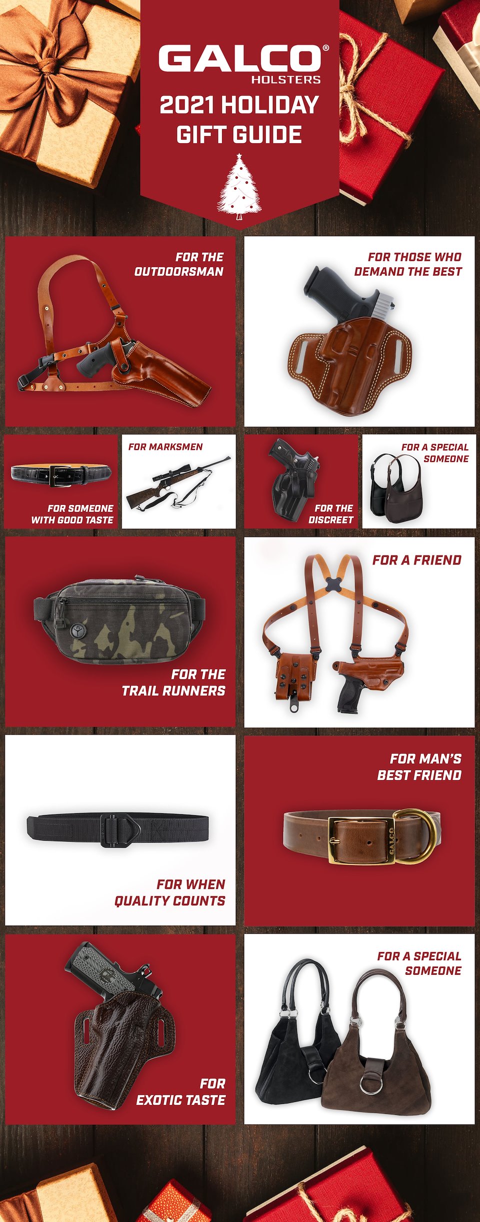
An additional variant swapping the in-use shots for more clean, less busy white background product shots.
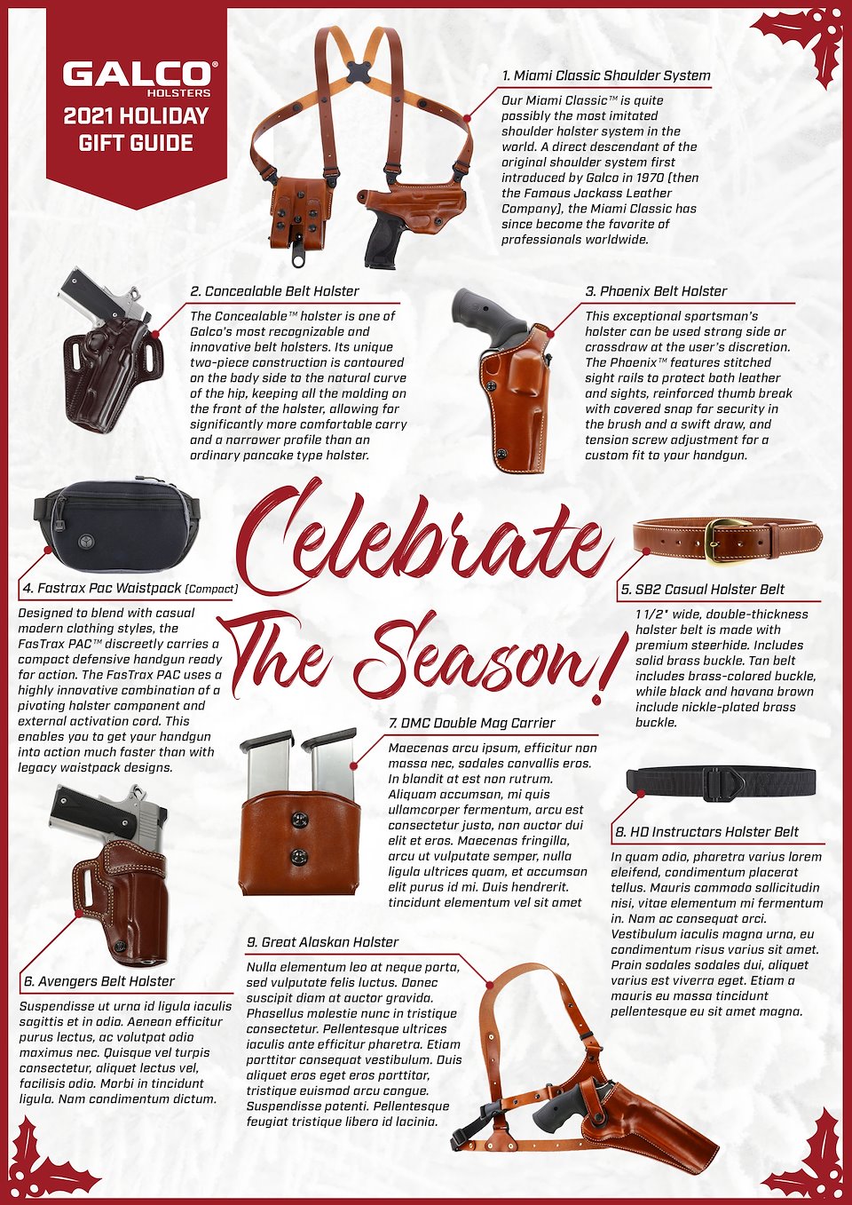
This was where we started to find the final product, the most popular of the initial variants which was developed further.
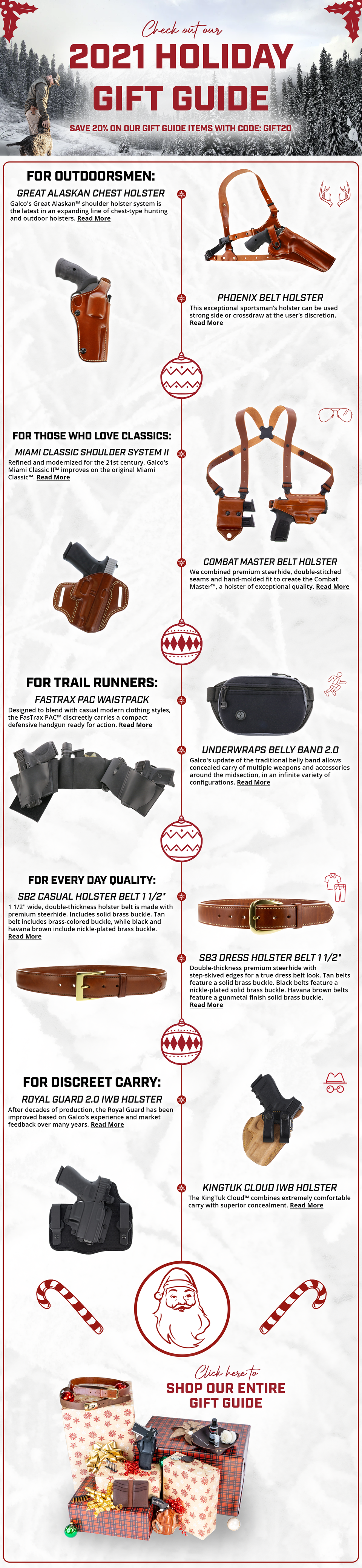
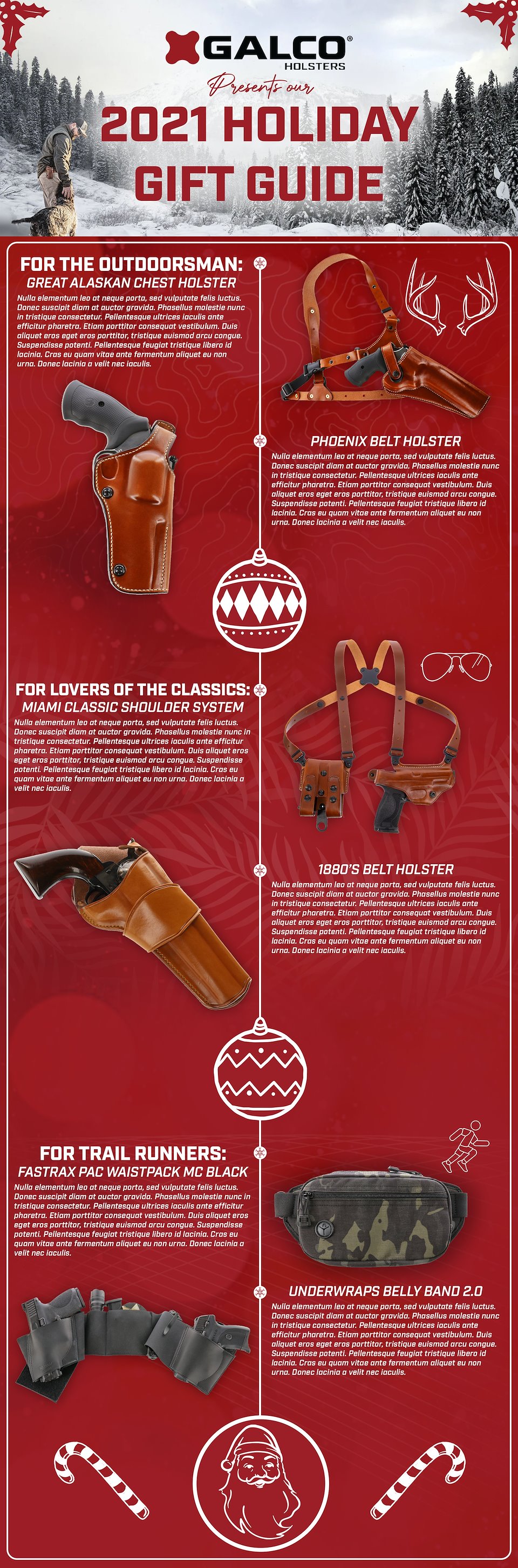
With a bit more freedom to spread the designs out and give them some breathing room as the email allowed for a very long format, I had some fun with a cleaner white look and the addition of some of my photography for the bottom present pile of products. I liked the graphic textures in the previous red variant, but the very subtle snow texture allowed more focus on the products themselves and let the tan leather 'pop' better.
Overall, this was a very fun project to get creative with and pursue lots of different solutions, doing something a bit above and beyond what Galco had done in previous years.